App Logo
Introduction
“Study Together” as a student-focused social networking app combines communication, resource sharing, and collaborative learning. It’s a platform that fosters academic interaction, allowing users to connect for task assistance, explore articles for learning, and access downloadable homework assignments and worksheets—all in a streamlined, engaging interface.
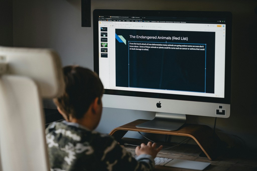
Photo by Annie Spratt on Unsplash
Role: UX/UI Designer
Timeline: 1 month
Software: Figma
Problem Statement
Problem Statement:
Alex, a college student, struggles to find a platform that meets his academic needs for collaboration and resource sharing. Existing tools are either too broad or lack features tailored to students, leaving Alex unable to easily connect with peers, share assignments, or ask questions in real time. Without an effective solution, Alex feels overwhelmed and disconnected, making it harder for him to stay productive and motivated. The Study Together app seeks to solve this by providing an intuitive platform designed specifically for students, enabling seamless collaboration, resource access, and community support.
User persona
To understand my app’s needs, I first studied the user persona provided by CareerFoundry. Most of the work had been done already, and the mood board is something I designed.
Name: Alex
Job Title and Experience: A student enrolled in an online course who works part-time as a retail store manager
Demographics:
- Age: 33
- Gender: Male
- Education: Working toward a Bachelor’s in History
- Marital Status: Engaged
Goals:
- Alex juggles studying and working part-time. He loves his subject, but also wants to complete his course as quickly as possible and gain marketable skills.
- To help with this goal, Alex wants to find things like relevant supporting materials, advice from fellow students on studying efficiently, and receive peer feedback.
- Alex would like to find like-minded students to collaborate with.
Tasks:
- Alex wants to find supporting materials to help him master the more complex subjects in his course.
- He wants to connect with like-minded students to share his work and collaborate.
- He wants a tool to keep him motivated and support his development as a student and beyond.
Environment:
- Physical: Alex lives in a small house with his partner.
- Social: His mentor (a volunteer alumnus from his course) told him about the tool. On weekends, he likes exercising at the gym and going out with his partner and friends.
- Technological: As a retail store manager, he has a basic understanding of technology. He uses till and stock management software. His course is very text-based, but he’s used online tools in the past to help with other academic endeavors.
Mood board
For the Study Together app, I refined existing brand elements and filled gaps to align with its focus on collaboration and productivity. I paired Poppins and Merriweather fonts for readability and motivation and used calming blues and greens with vibrant accents for positivity.
I added rounded buttons, simple icons, and light textures for warmth, alongside minimalist illustrations and interactive features like motion effects and badges. Feedback and prototyping ensured a cohesive, user-friendly design.
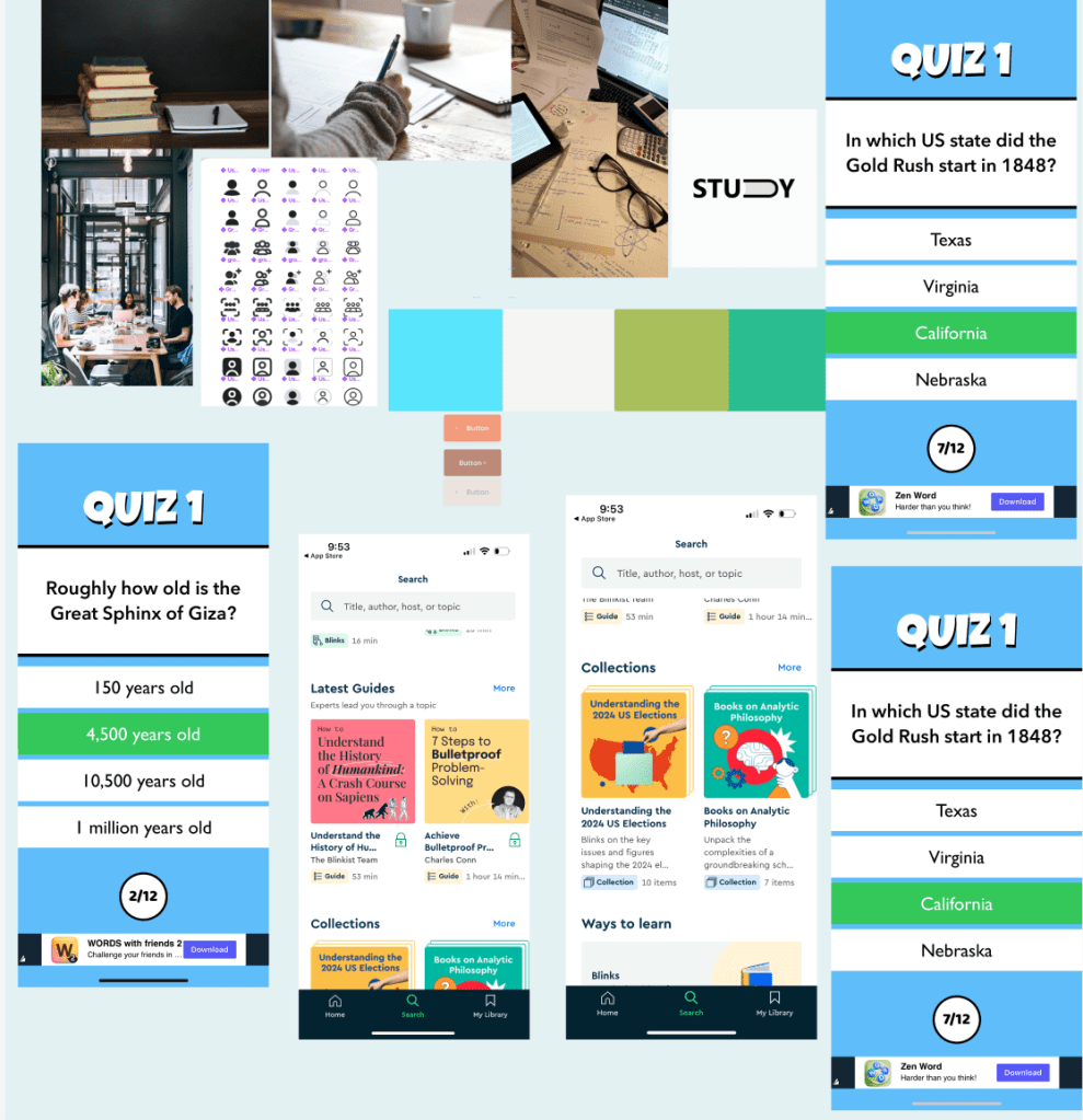
Style guide
Here is a glimpse of my style guide for the project. I designed this guide to map out every element, icon, and the logo that I would use.


Creating the style guide for Study Together required building a strong brand identity from the ground up. I began with the logo, focusing on the app’s mission of academic collaboration. The design used clean, modern shapes to appeal to students and worked well across app icons and marketing materials. For typography, I chose Lato, a clear and versatile sans-serif font. Its modern look fit the app’s youthful audience, and I established a consistent text hierarchy for headings, body text, and labels.
The color palette featured blue, green, and white to symbolize trust, growth, and balance. To make the design more engaging, I included diverse student imagery and playful academic-inspired illustrations. Subtle patterns like grids and notebook lines added depth without cluttering the interface. I improved contrast for better accessibility and modernized outdated elements to align with student needs. Through testing and feedback, I refined the design to create a cohesive, user-friendly style guide that reflects Study Together’s mission of collaboration and academic support. If you want to read and see my complete style guide, then click the link below:
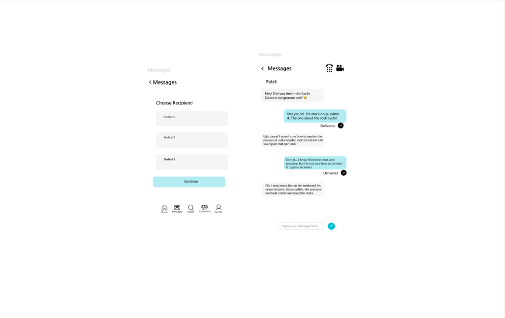
UI Elements and Icons
The design elements in the Study Together style guide were crafted to directly address the needs of the app’s target audience—students seeking academic collaboration and support. Each element was chosen with the objective of creating a platform that feels approachable, organized, and conducive to learning.
The message envelope icon is a key feature that supports the app’s goal of fostering communication. It visually represents direct messaging, an essential tool for students to connect, ask questions, and share resources in a private setting. The icon’s clean and modern design ensures it is immediately recognizable and aligns with the app’s cohesive aesthetic.
The community handshake icon is another highlight, symbolizing collaboration and mutual support. This icon serves as a visual anchor for the app’s community features, reinforcing the idea of teamwork and shared growth. Its rounded, friendly design makes it approachable and encourages users to engage with others in forums and group settings.
Together, these icons enhance usability by clearly communicating their functions and reducing cognitive load for users. They also contribute to the app’s overarching design objective: to create a seamless, user-friendly experience that supports academic success and builds a sense of community among students. By integrating these symbols into the app, I aimed to make the interface both intuitive and visually engaging for the target audience.

Photo by Jaron Nix on Unsplash
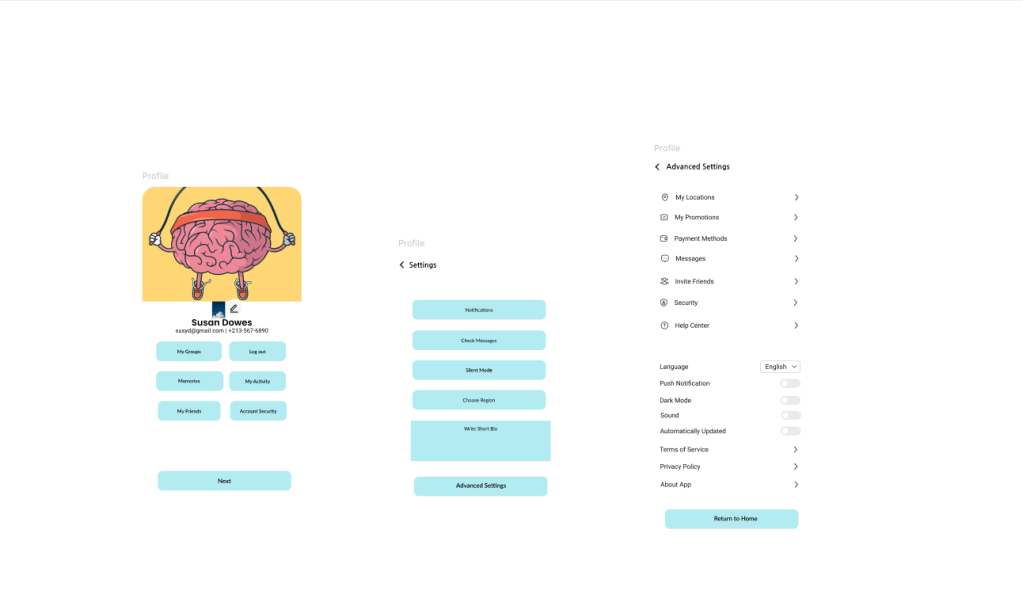
High-Fidelity Prototypes
Here is a preview of the high-fidelity prototypes. If you click the link at the bottom, you’ll be able to see my final prototype.
What I learned
Working on the Study Together app taught me key lessons in design, user experience, and development. I created a cohesive visual identity by selecting the Lato typeface, a blue-green-white palette, and meaningful icons like the message envelope, ensuring branding consistency and usability.
Focusing on students’ needs, I prioritized features like real-time messaging, forums, and easy file sharing to enhance collaboration. The project also sparked my interest in backend development, highlighting its role in enabling core app functions. Iterative feedback improved navigation and clarified features, resulting in a user-friendly, lightweight app.
